
How to Read DOSM Household Income Surveys
Practical guide to understanding Department of Statistics Malaysia reports. We’ll show you what the numbers mean and how they apply to your situation.
Understanding DOSM Data Matters
Every quarter, the Department of Statistics Malaysia releases household income surveys that measure how Malaysians earn, spend, and manage their finances. These reports shape policy decisions and inform business strategies. But here’s the thing — most people don’t know how to actually read them.
The numbers are real. The trends are significant. But the presentation can feel overwhelming if you’re not familiar with statistical language. We’re going to break down the key sections, explain what the figures actually tell you, and show you how to extract the insights that matter to your situation.
Whether you’re tracking wage growth, assessing cost of living impacts, or understanding minimum wage changes, knowing how to interpret DOSM data puts you ahead. Let’s walk through it together.

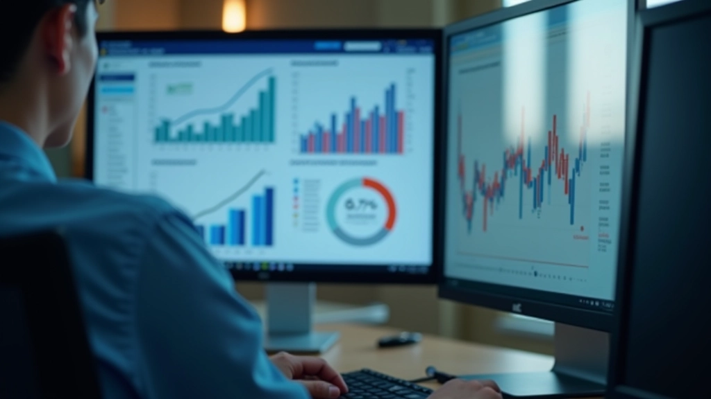
Survey Structure & Key Sections
DOSM household income surveys follow a consistent format, which is helpful once you know what you’re looking for. The report starts with executive highlights — key findings summarized in plain language. This section tells you what changed since the last survey and what’s notable about this quarter.
Next comes demographic breakdown. You’ll see income sliced by age groups, employment status, education level, and geographic region. This matters because wage growth isn’t uniform. A 3% increase might be happening for professionals in Kuala Lumpur while remaining flat for workers in smaller towns.
Then you’ll find income distribution tables showing how many households earn in specific ranges. Don’t skip this — it reveals whether income gaps are widening or narrowing. Finally, there’s household composition data linking family size, dependents, and earning patterns.

Critical Metrics to Track
These numbers appear throughout DOSM reports and they’re worth understanding.
Median Monthly Household Income
This is the middle point — half of households earn more, half earn less. It’s more reliable than average income because it’s not skewed by extremely high or low earners. When DOSM reports this increased 5%, it means the typical Malaysian household is earning 5% more.
Mean Household Income
The mathematical average. This gets pulled higher by top earners, so it’s often bigger than the median. Compare both numbers — if mean is significantly higher than median, wealth is concentrating at the top.
Income Quintiles
Households divided into five equal groups by earnings. The bottom quintile earns the least, the top quintile earns the most. DOSM shows how much each group earned, revealing if wage growth is helping everyone equally or just benefiting higher earners.
Gini Coefficient
Measures income inequality on a 0-1 scale. Closer to 0 means more equal distribution. Malaysia’s coefficient hovers around 0.40-0.42, indicating moderate inequality. Watch how this changes quarter to quarter.

Reading Tables & Making Connections
DOSM reports are table-heavy. Each table shows income data organized by a specific variable — age, sector, education, state. Here’s how you extract real insights from them.
Look at the year-over-year change column first. Is it positive or negative? What’s the percentage? Then compare across categories. If private sector income grew 4% but government sector grew only 1%, that tells you where wage momentum is happening. You’re not memorizing numbers — you’re spotting patterns.
Cross-reference multiple tables. Check if education level correlates with income growth. Does living in urban areas translate to higher wage increases? Does age matter? When you see consistent patterns across different table breakdowns, you’ve found a real trend. One table showing something unusual might be noise. Three tables showing the same pattern? That’s signal.
Real-World Application
You’re wondering what this means for actual wages and cost of living. That’s where you connect DOSM data to your circumstances.
If DOSM shows median household income up 3% but inflation is running at 4%, real purchasing power actually declined. Your nominal income increased but you’re buying less. This is why checking the inflation rate alongside income figures matters. DOSM doesn’t adjust for inflation in their primary reports — you need to do that calculation.
When minimum wage changes get announced, look at DOSM data for the affected sectors. How many workers earn at or near the minimum? Did the previous minimum wage increase actually reach people? DOSM breaks this down by income ranges, showing you the real distribution. You’re not guessing whether policy worked — you’re checking the evidence.

Important Limitations
DOSM surveys are comprehensive and professionally conducted, but they’ve got boundaries. The data comes from household surveys, which means response rates matter. If lower-income households are less likely to respond, the figures might slightly undercount their prevalence.
Timing matters too. DOSM releases quarterly reports, but there’s always a lag. The data you’re reading today represents activity from a few months ago. During rapid economic shifts, that lag can make trends feel outdated.
Finally, remember these are aggregate figures. A statement that “household income grew 3%” doesn’t tell you whether your household grew 3%. Regional variations, sector differences, and individual circumstances create huge variation around the average. Use DOSM data as context for broader trends, not as a personal prediction.
Putting It All Together
Reading DOSM household income surveys isn’t difficult once you know where to look and what the numbers represent. Start with the executive summary. Skim the headline findings. Then dive into the tables for your demographic categories — your age group, sector, education level, location.
Cross-check income growth against inflation rates. Look for patterns across multiple tables rather than relying on single data points. Connect the quarterly changes to policy shifts or economic events you remember from that period. You’re building narrative context around the numbers.
The skill you’re developing is pattern recognition with data. It’s not about becoming a statistician — it’s about reading reports with confidence and extracting insights that inform your own financial decisions. DOSM data is public. It’s free. And once you understand how to read it, you’ve got a solid foundation for understanding wage trends, cost of living shifts, and how policy changes actually affect Malaysian households.
Want to go deeper into specific aspects of wage analysis? Explore our related guides on real wage calculation methodology and minimum wage revision impacts.
Related Resources

Minimum Wage Revision Impact Analysis
Read Analysis
Productivity and Wage Growth Fundamentals
Learn FundamentalsInformational Disclaimer
This guide is educational material intended to help you understand how to interpret DOSM household income surveys. It’s not financial advice, investment guidance, or professional economic analysis. The information presented explains general concepts and how to read published statistics.
DOSM data represents aggregate household statistics and may not reflect individual circumstances. Wage trends shown in surveys don’t predict personal income changes. If you’re making financial decisions based on income trends or wage policies, consult with qualified financial advisors or economists who understand your specific situation.
Data sources, methodology, and detailed tables are available directly from the Department of Statistics Malaysia website. Always reference official sources when relying on specific figures.